Exploratory Data Analysis
First, we create a time series plot for weekly sales of type A stores from the Walmart dataset mentioned in Data Visualization tab.
Code
ggplot(A_sales,aes(x=Date,y=avg))+
  geom_line()+
  labs(
    x = "Date",
    y = "Weekly sales"
  )+
  ggtitle("Weekly sales of type A stores")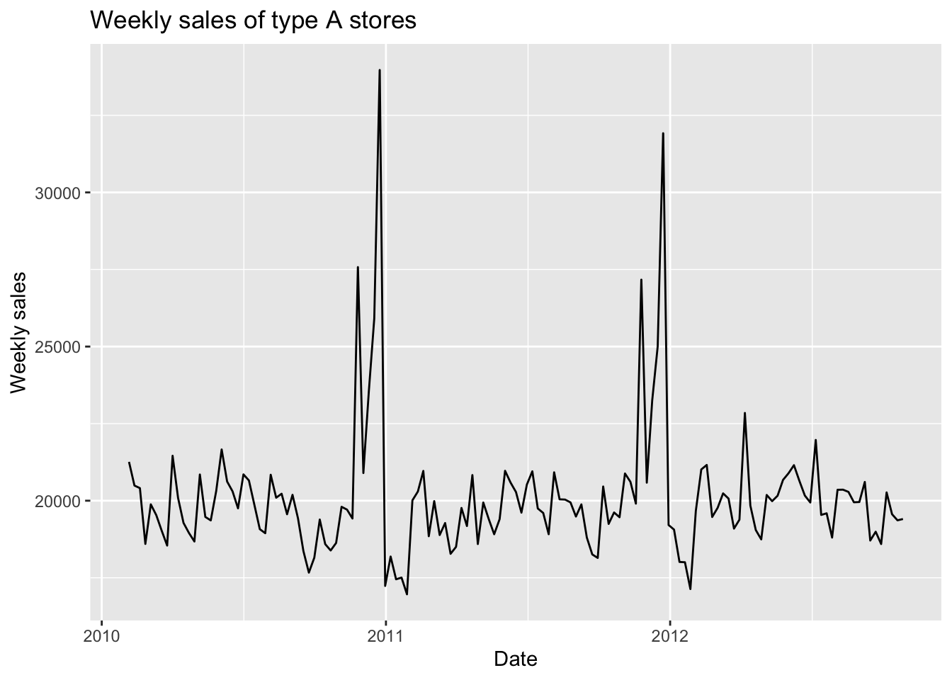
According to this plot, we can clearly see some periodic fluctuations every year. At the end of every year, the weekly sales reach two consecutive peaks. The trend and monthly seasonality are not obvious. Since the variation of data does not change significantly in different years, the components of this time series are more likely to be additive.
1 Lag Plot
Code
temp.ts = ts(A_sales$avg, start=decimal_date(as.Date("2010-02-05")), frequency = 365.25/7)

gglagplot(temp.ts, do.lines=FALSE, lags=1)+xlab("Lag 1")+ylab("Yi")+ggtitle("Lag Plot for Weekly Sales")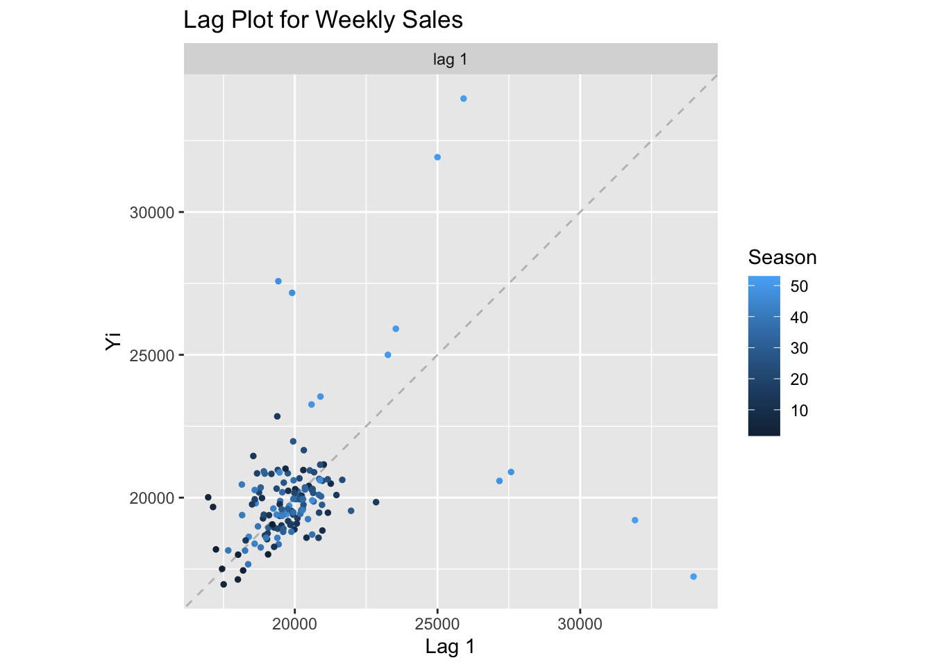
This lag plot shows information consistent to what we discussed above. The weekly sales near the end of years are much higher than sales of other time. Besides these extremely higher values, weekly sales of other time seem to be stationary.
2 Decomposition
Now, let’s decompose this time series:
Code
ts_decomp=decompose(temp.ts, "additive")
autoplot(ts_decomp)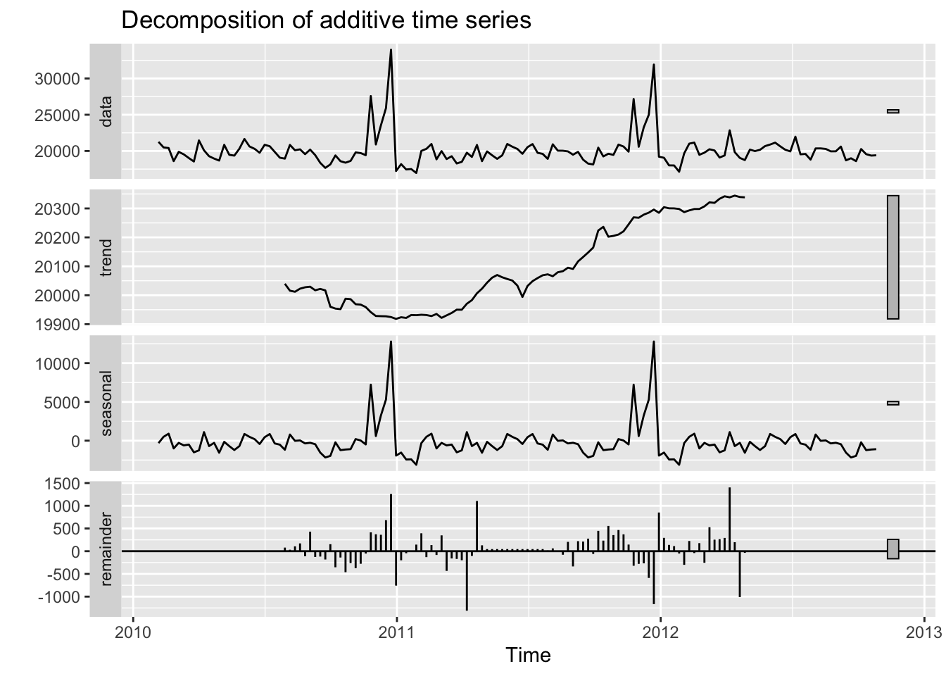
From the results of decomposing, we can notice yearly seasonal component. The trend does exist, but it is not so significant according to the y-axis.
3 ACF and PACF
Then, plot ACF and PACF to see the autocorrelation and stationarity:
Code
ggAcf(temp.ts,150)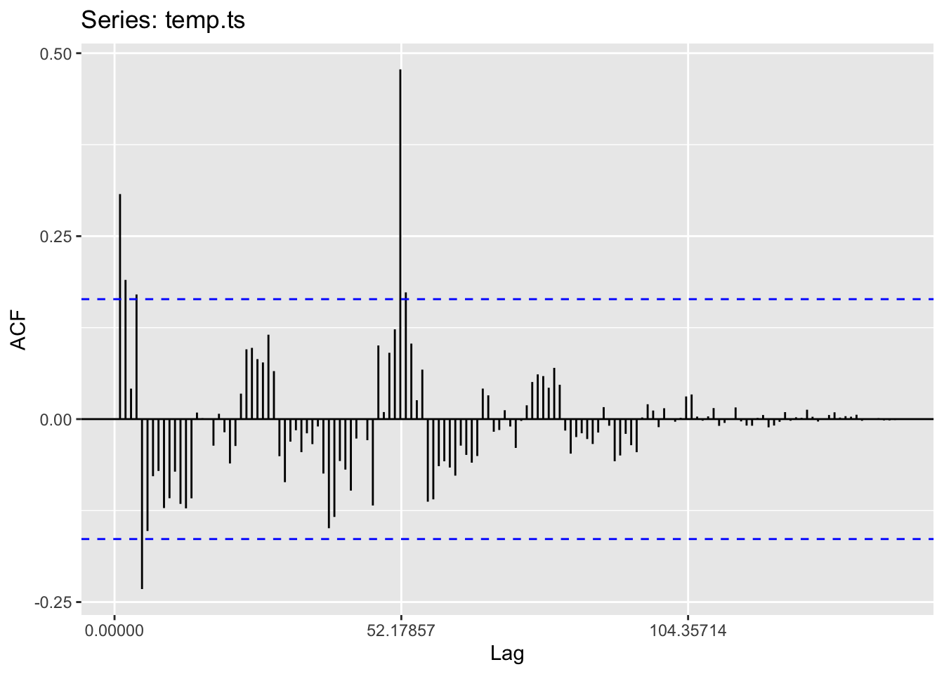
According to this ACF plot, we notice an extreme value at lag 50, which also represents the end of years. Besides this extreme value, the autocorrelation is not significant and this time series is likely to be stationary.
Code
ggPacf(temp.ts,150)
PACF plot also shows relatively good stationarity.
4 Dickey-Fuller Test
Finally, use the Augmented Dickey-Fuller Test to further check the stationarity:
Code
adf.test(temp.ts)
    Augmented Dickey-Fuller Test

data:  temp.ts
Dickey-Fuller = -5.3171, Lag order = 5, p-value = 0.01
alternative hypothesis: stationary
From the results of Augmented Dickey-Fuller Test, the p-value is smaller than 0.05, which means that we have enough evidence to reject the null hypothesis and we can conclude that this time series is stationary.
5 Moving Average Smoothing
In this part, I will use moving average smoothing to identify the underlying pattern of the data.
Code
sma52=SMA(temp.ts,n=52)
sma13=SMA(temp.ts,n=13)
sma5=SMA(temp.ts,n=5)

df=data.frame(
  year=index(temp.ts),
  original=temp.ts,
  ma_5=sma5,
  ma_13=sma13,
  ma_52=sma52
)
df=melt(df,id=c("year"))
names(df)=c("Date", "Type", "Sales")

Palette <- c("black", "red", "green", "orange")

ggplot(df, aes(x=Date,y=Sales,color = Type))+
  geom_line()+
  scale_colour_manual(values=Palette)+
  ggtitle("Weekly sales of type A stores for different moving average windows")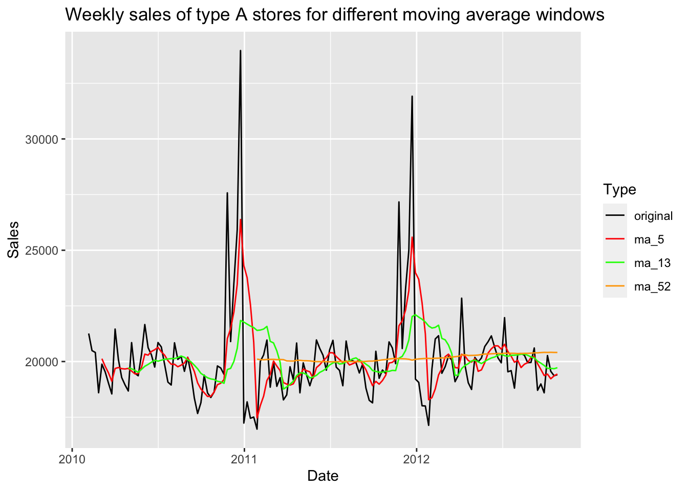
In this plot, black line represents for the original data and other color represents for three different windows of moving average smoothing. We can notice that when the number of moving average window is 5, the trend and seasonality is still as obvious as the original data. When the number is 13, the peaks at the end of every year is also significant but the peak values are much lower than original data. When the number is 52, which is the number of weeks in a year, the seasonality disappears and we can only notice a slightly increasing trend.