Data Visualization
The data that we will use in this part is the weekly sales data of Walmart from 2010 to 2012. There are totally 45 stores included in this data, and every store contains different numbers of departments.

Code
walmart=read.csv("./data/Walmart_sales_data.csv")
knitr::kable(
  head(walmart)
)| Store | Dept | Date | Weekly_Sales | IsHoliday |
|---|---|---|---|---|
| 1 | 1 | 2010-02-05 | 24924.50 | FALSE |
| 1 | 1 | 2010-02-12 | 46039.49 | TRUE |
| 1 | 1 | 2010-02-19 | 41595.55 | FALSE |
| 1 | 1 | 2010-02-26 | 19403.54 | FALSE |
| 1 | 1 | 2010-03-05 | 21827.90 | FALSE |
| 1 | 1 | 2010-03-12 | 21043.39 | FALSE |
These are top 6 lines of this sales data, which include store number, department number, date, weekly sales and a boolean variable showing whether the date is a holiday.
Code
type=read.csv("./data/Walmart_stores.csv")
knitr::kable(
  head(type)
)| Store | Type | Size |
|---|---|---|
| 1 | A | 151315 |
| 2 | A | 202307 |
| 3 | B | 37392 |
| 4 | A | 205863 |
| 5 | B | 34875 |
| 6 | A | 202505 |
This data set shows the type of each store. These 45 stores are divided into three categories according to the store size.
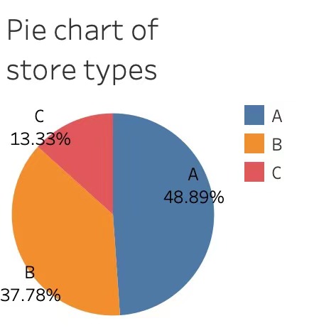
This is a pie chart generated by Tableau. It shows that near half of the stores belong to type A and only a few stores are defined as type C.
Code
ggplot(type, aes(x = Type, y = Size, fill = Type)) +
  geom_boxplot() +
  ggtitle("Boxplot of store size with different types")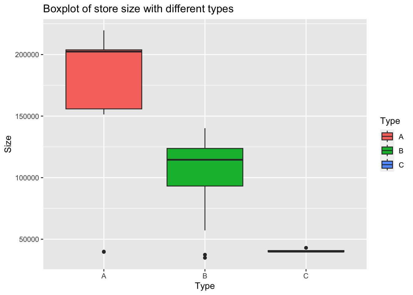
This boxplot clearly indicates the type dividing criterion: stores of type A have largest size while those of type C have smallest size.
Next, I will plot the linegraph for average weekly sales of all the stores and departments within each type.
Code
df=merge(walmart,type,by="Store")

A_bytime=group_by(df[df$Type=='A',],Date)
B_bytime=group_by(df[df$Type=='B',],Date)
C_bytime=group_by(df[df$Type=='C',],Date)
A_sales=summarise(A_bytime,avg = mean(Weekly_Sales))
B_sales=summarise(B_bytime,avg = mean(Weekly_Sales))
C_sales=summarise(C_bytime,avg = mean(Weekly_Sales))

A_sales$Date=as.Date(A_sales$Date)
abc_sales=A_sales
abc_sales$B=B_sales$avg
abc_sales$C=C_sales$avg
names(abc_sales)=c('Date','A','B','C')
abc_sales=melt(abc_sales,'Date')
names(abc_sales)=c("Date","Type","value")

ggplot(abc_sales,aes(x=Date,y=value,colour=Type))+
  geom_line(linewidth=0.75)+
  labs(
    x = "Time",
    y = "Weekly sales",
  )+
  ggtitle("Average weekly sales of three different types of stores")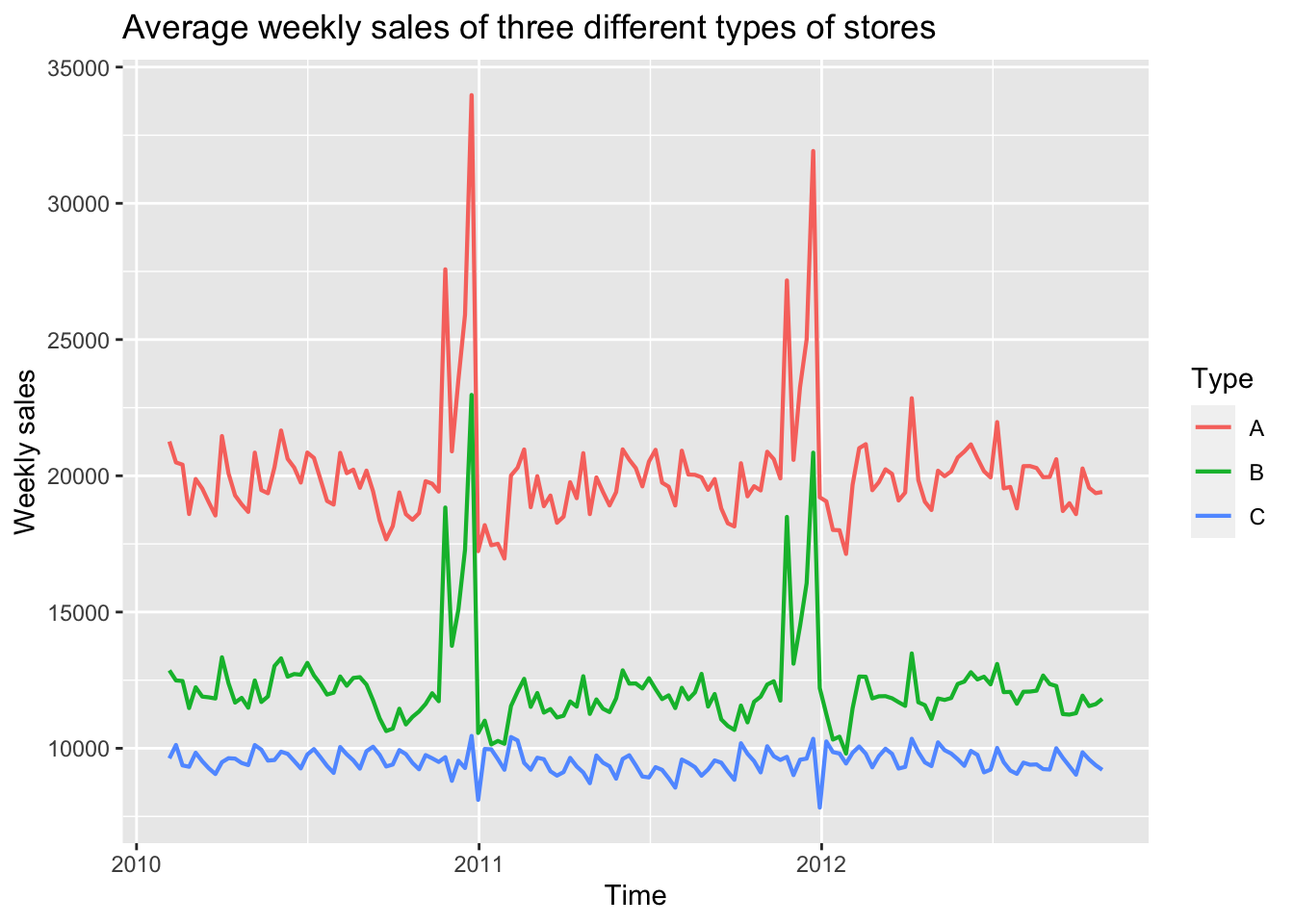
According to this plot, we can see that although average sales of type A are significantly higher than other two types, the patterns for type A and B are very similar. The weekly sales of both these two types reach the peak at the end of each year, which corresponds to Thanksgiving and Christmas. By contrast, weekly sales of type C stores do not have obvious peaks and are more likely to be stationary.
Then, I will focus on type A stores and visualize the weekly sales considering the holidays.
Code
walmart$Date=as.Date(walmart$Date)
walmart_1.1=walmart[walmart$Store==1 & walmart$Dept==1,]
A_sales$isholiday=walmart_1.1$IsHoliday

ggplot(A_sales,aes(x=Date,y=avg))+
  geom_line()+
  geom_point(data=A_sales[A_sales$isholiday==TRUE,],aes(x=Date,y=avg,colour='red'),show.legend = FALSE)+
  labs(
    x = "Date",
    y = "Weekly sales"
  )+
  ggtitle("Weekly sales of type A stores")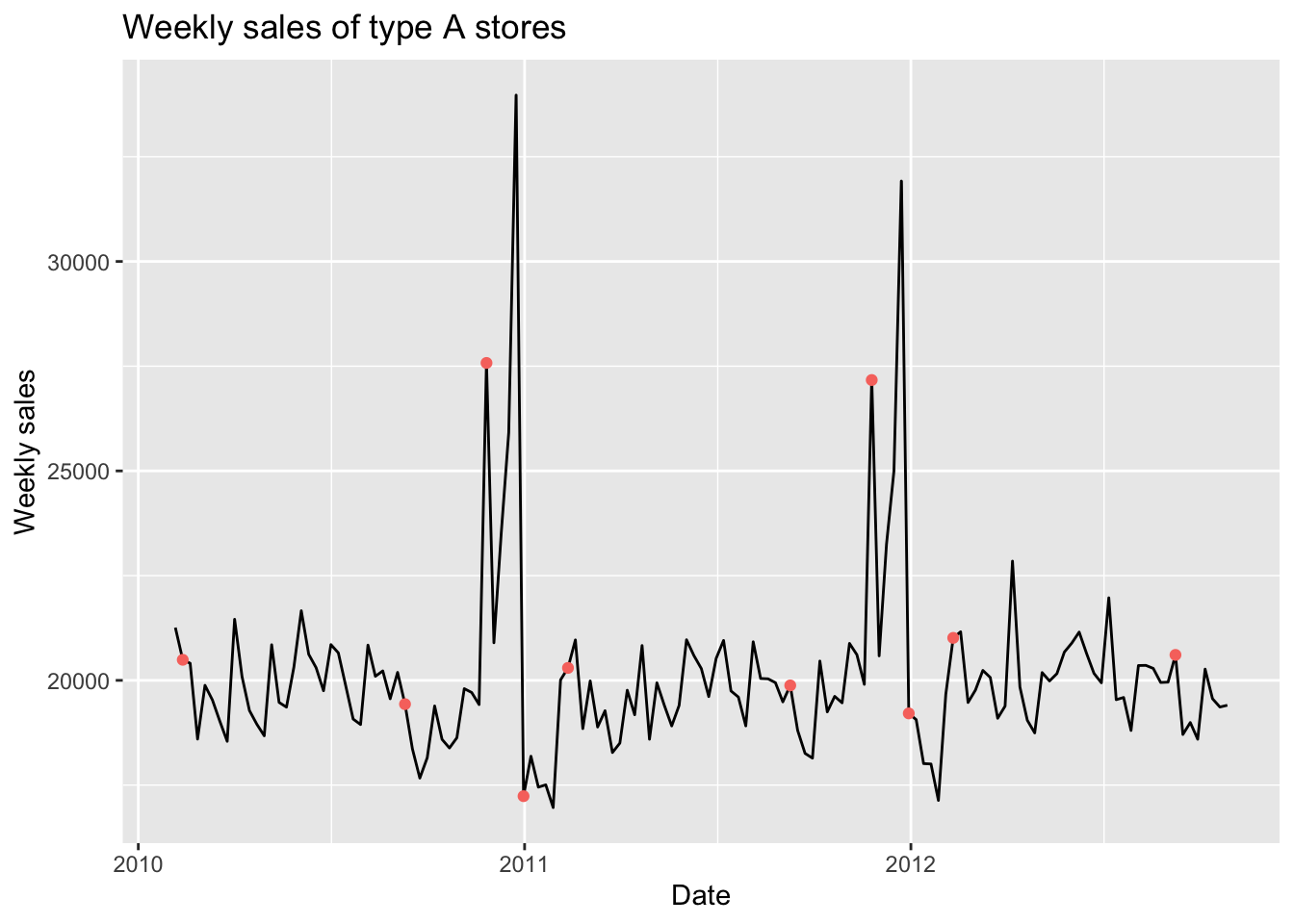
The red points in this plot represents the holidays. Note that the date of peak is Dec 24th, but it actually calculates the sales of the week before Christmas, therefore, it is not defined as a holiday. Considering this rule, sales of holidays seems to be higher. We can verify this conclusion by creating a boxplot.
Code
ggplot(A_sales, aes(x = isholiday, y = avg, fill = isholiday)) +
  geom_boxplot() +
  ggtitle("Weekly sales of holidays and others")+
  labs(
    x = "Holiday or not",
    y = "Weekly sales"
  )+
  guides(fill = guide_legend(title = "Holiday or not"))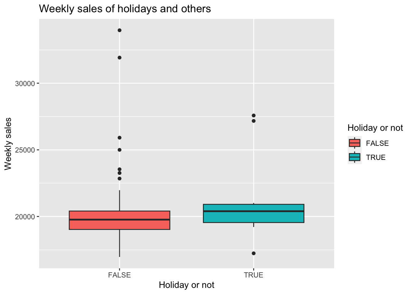
From this boxplot, we can see that average weekly sales of holidays are higher that other days.